Improved Python Program for BeamNG Lap Analysis
Overview
The previously published section introduced BeamNG lap analysis using a Python program which took in the UDP packets sent out by BeamNG, converted them into a usable format and then either plotted the data or displayed a value of a parameter. This program was a good introduction into plotting data with Python - using Matplotlib for the graph plotting and Tkinter for the GUI. Unlike the previous section, this section does not show any rigorous lap analysis, but rather focuses on the Python program itself.
The end of that section noted one main problem I had - the plotting speed of the graphs. More live graphs would, understandably, slow down the framerate of the graphs. This was not desired, as fine details might be missed in the graphs that would help improve my driving. I mentioned trying to run the program over multiple threads or using a different programming language (such as c++) that generally performs faster than Python. What I ended up doing instead was still using Python, but using a new GUI package and a new plotting package - PyQt6 and pyqtgraph.
PyQt6 is a comprehensive GUI package that can be used to build complex GUIs and applications, and also allows for use of pyqtgraph for graph plotting instead of matplotlib. As stated on the pyqtgraph website (https://www.pyqtgraph.org/), pyqtgraph is suitable for graphing that requires rapid plot updates - exactly what I was looking for.
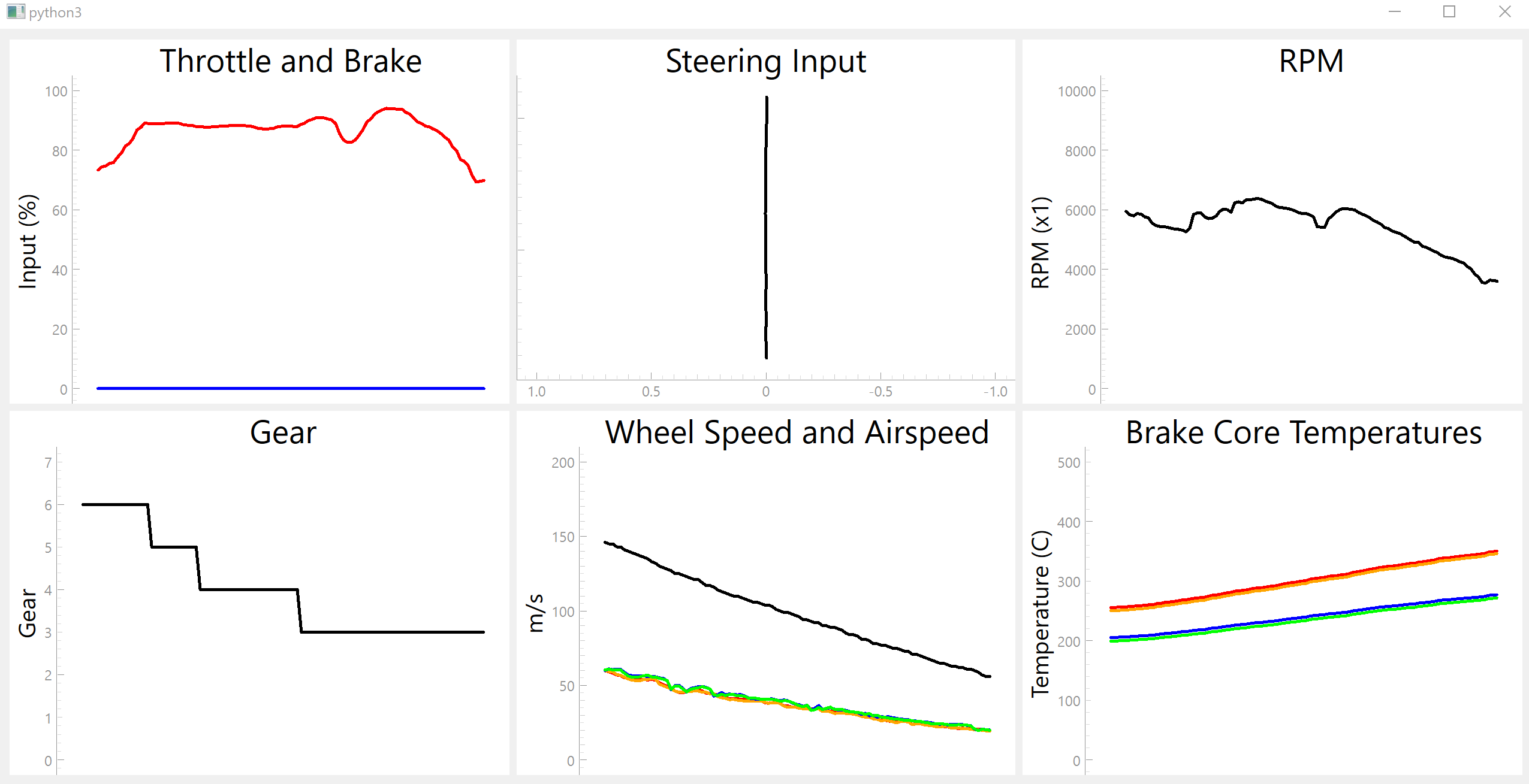
The current GUI shows 6 plots with a total of 14 live data lines and some new features:
- The steering graph was changed so any left steering would move the graph horizontally left and vice versa. This made it easier to visualise steering inputs.
- Airspeed and wheel speeds: the default speedometer in BeamNG shows some sort of wheel speed - this can be seen by clutch dumping and watching the speedometer shoot up to, for example, 40mph - but the car has barely started moving. Whilst the plotted airspeeds and wheel speeds do not match under normal driving, the graph can still highlight wheel spin and brake locking - these are shown by sudden changes in the wheel speed and not much change in the airspeed.
- Brake core temperatures were added to see when the brakes are in the operating temperature range. It is easier to see on a graph if there is a trend of the brake temperatures sitting in a certain range compared to a singular value.
- Gear is now plotted on a graph to see gear history throughout driving
For:
- The throttle and brake plot: the blue line is the throttle input and red is the brake input
- For the wheel speed and brake temperatures: the red line is front left, orange is front right, blue is rear left and green is right rear.
Short Use Case
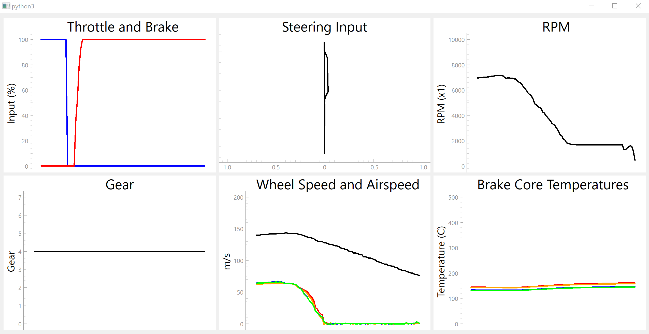
The images below show instances in which the program can show driving problems. In the first, brake locking is shown. The brake input was applied suddenly and there is a brief moment in which the airspeed and wheel speed decrease normally, but as the brake input is held at 100%, the brakes lock up. All lines for the wheel speeds drop to zero whilst the airspeed remains above 0, i.e. the car is still moving but the tyres are not → the brakes have locked up. During some test laps using the same car and same track as the previous section, the plot showed brake locking that I didn’t even realise was occurring, especially into turn 12. The rear brakes were locking slightly under braking, meaning that I was braking earlier to get the car slowed down in time for the corner.
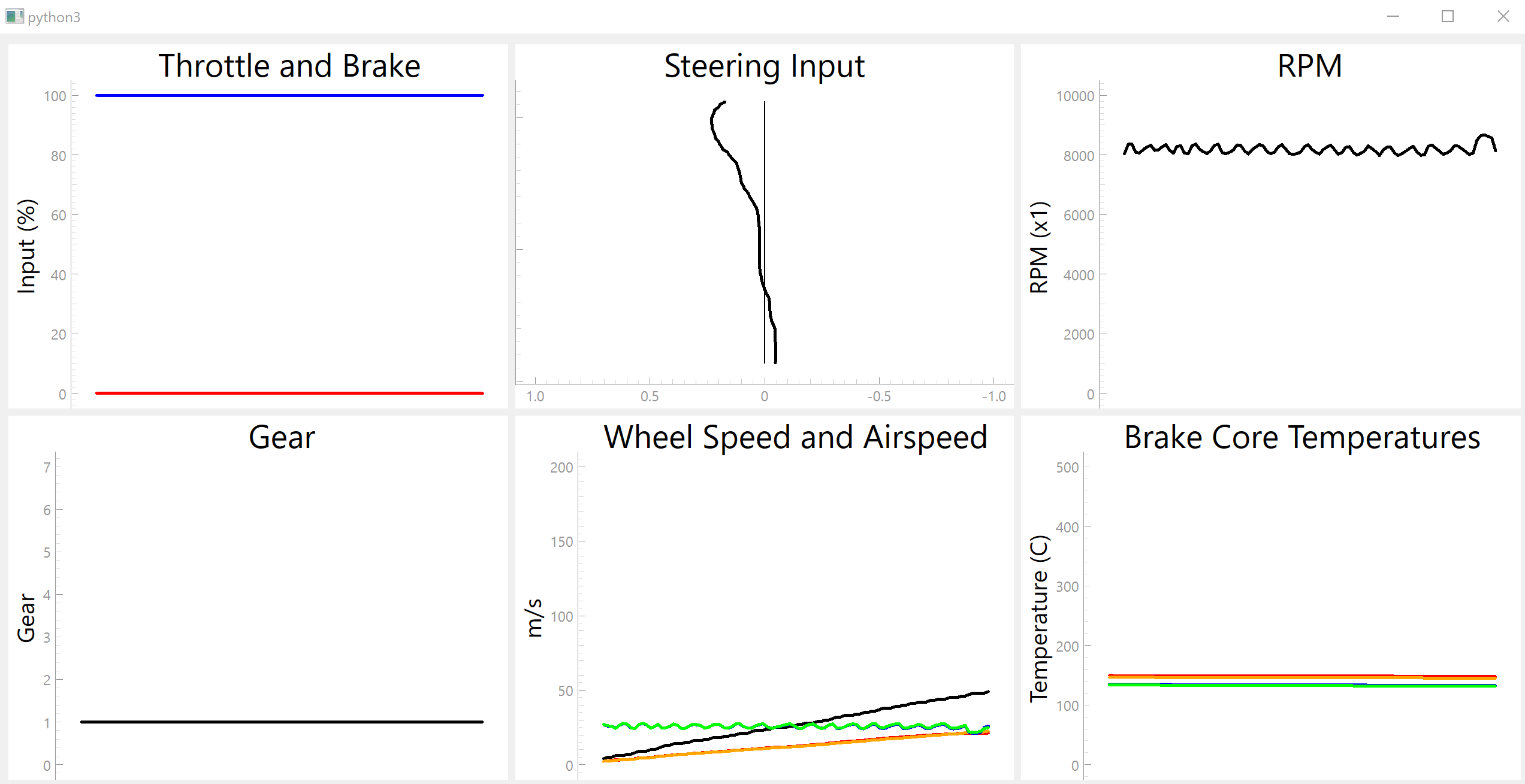
The second image shows a launch with a clutch dump to easily highlight wheel spin. The car used was rear-wheel drive. Wheel spin is seen on the plot when the tyre speed for the front or the rear tyres increases, but the other tyres remain normal (e.g. the rear tyres speeds increase suddenly but the front tyre speeds remain normal when using a rear-wheel drive car). The rear tyres in this example can be seen to immediately start moving, whilst the front tyres and airspeed are low. Less extreme wheel spin was often seen exiting corners and applying the throttle too early - the rear wheels didn’t have enough traction to deal with the extra power and started to spin.
Whilst the images show some extreme examples to highlight the features of the program, hopefully it is clear to see how the program could be used in the future for more detailed lap analyses.
Limitations
Due to the nature of how UDP transfers work, it meant that some received packets had errors in them which, of course, couldn’t be used by the program. To get around this problem, I decided that if data from BeamNG came with errors, then data for this particular time would be set to the data that was just used, e.g. if a brake temperature was 300C and then the next value came in as an error, the error would be set to 300C, i.e. the previously used value. This leads to occasional ‘non-smoothness/jumps’ in the graph (sudden jump to next data point rather than a smooth transition), but is generally fine. UDP is the only available mode of data transfer that BeamNG has currently, so this issue will remain for now.
Future Work
Some future ideas include:
- Option to swap graphs in place, e.g. swapping the steering angle plot for a fuel remaining plot.
- A damage warning system: BeamNG has the ability to send out values for damaged parts, so possibly a map/diagram of the car and where the damage has occurred and to what extent.
- I wanted to add a graph for suspension travel, but this was more complex than anticipated. This would take some work to properly implement.
- A timing system to show lap times and lap time deltas.